
I am often asked how I go about creating a car illustration or livery design.
In this post I will focus on a high detail side view illustration of a single seater racecar, the 2002 World Series by Nissan Dallara of the late Justin Wilson which featured on the limited edition ‘The Winning cars of Justin Wilson‘ print in October 2015.
Note, this is not one of my liveries.
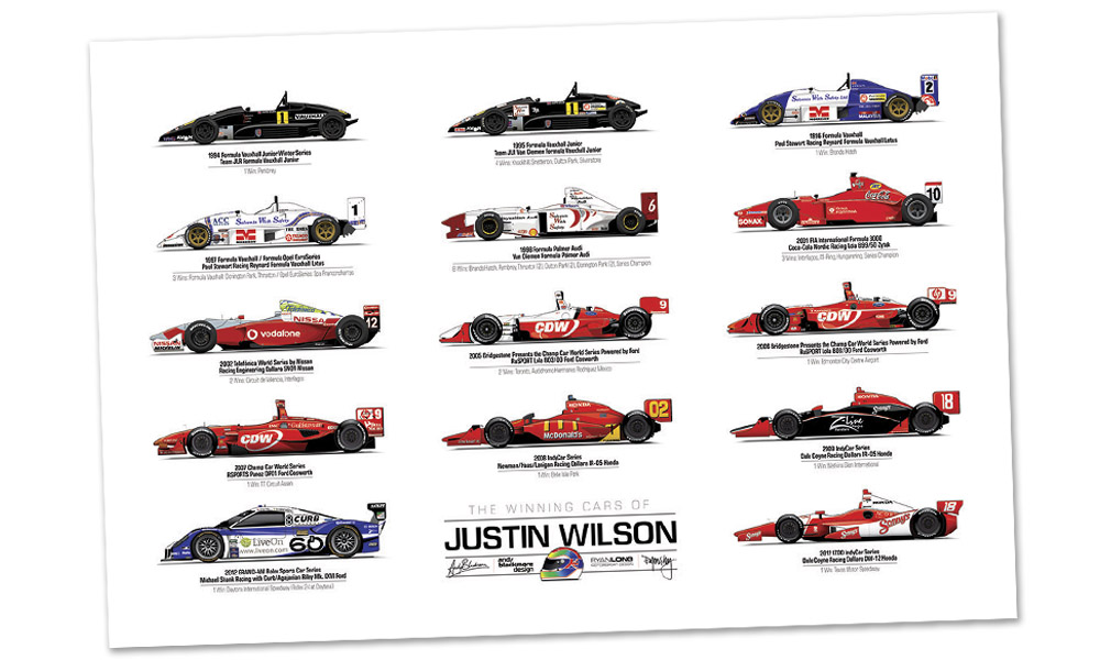
The print featured 14 cars created by INDYCAR Art Director, Ryan Long and myself.
Some cars (Indycars, DP, Lola Champ cars) had been previously drawn and needed an update. Others such as the Formula Palmer Audi had been drawn for a different team while the rest were drawn from scratch. Ryan supplied the CCWS Panoz DP-01 and the Indycars as well as nailing the layout and typography.
I use Adobe Illustrator for 99% of all my liveries, dipping into Photoshop when I need to. Illustrator is a vector based program (meaning each shape is its own object which is created by a series of points and edges, these are scale-able to infinity). Most company logos are in vector and the nature of wrapping (or illustrating) a racecar works perfectly for the crisp lines of Illustrator.
If you have used vectors in Photoshop, then you will know the basics, but Illustrator has an amazing depth. My first experience was v 3.1 all the way back in 1995 when I started working for McLaren, it was much simpler back then, but still an amazing tool to use.
Anyway, back to the tutorial….
Normally if you are working with a team on a livery, you can get scale line drawing. Smaller teams don’t have access to this, but its vital any drawing is to scale as this is the foundation to your design.
All photographs have perspective, even if its with a 800mm lens standing 20 foot away, so you have to factor that into any scale drawing.
At minimum you need overall dimensions, wheelbase, length, height (that is sometimes off due to ride height), width (check if with mirrors), plus front and rear overhang.
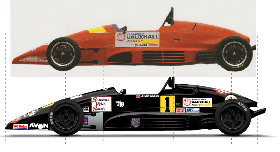
You can then construct the car. This is how I created the Formula Vauxhall Junior (above). This takes, time and years of practice, plus knowing Adobe Illustrator really well (I first started using it in 1995!)
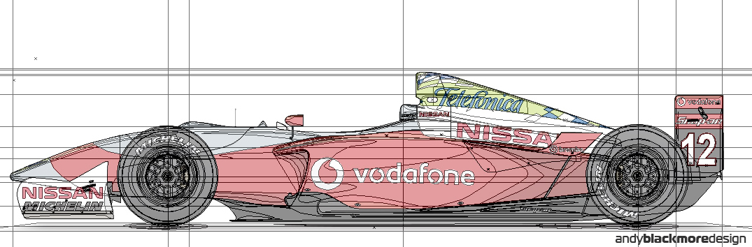
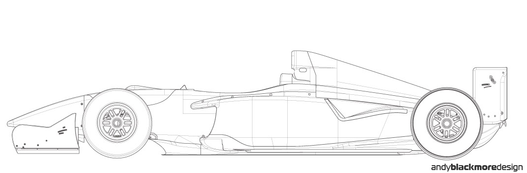
For the rest of the tutorial, I will focus on the Dallara built World Series by Nissan chassis which Justin raced.
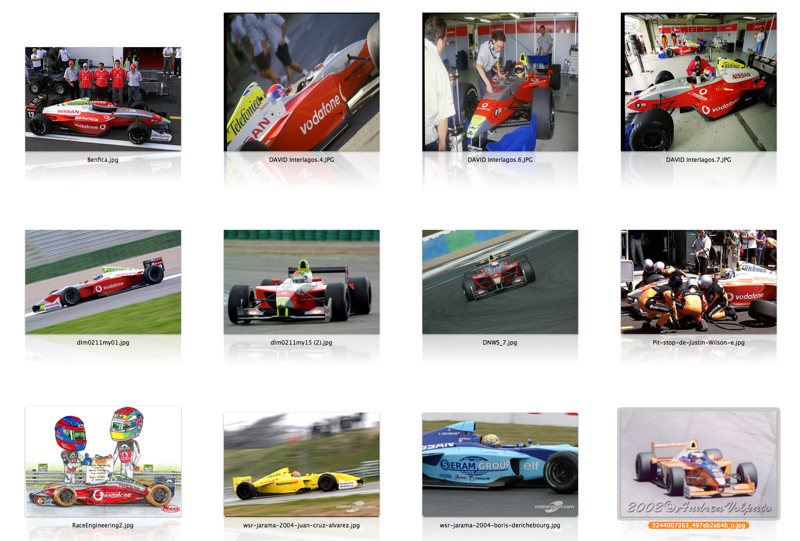
As the World Series by Nissan wasn’t a true ‘international’ series and ran 13 years ago, there wasn’t much reference, so I saved anything I could which showed the form of the car including rival teams. A good collection of imagery is always useful, even for a new car. Often CAD will be signed off and the final car will have small shutline or surface differences due to changes in production which isn’t always carried through. Often, details such as Mirrors (see below) are left off.
This was the hardest card to research, I’d resorted to 800 pixel YouTube videos for referece!
Fast forward a week and through Ryan and INDYCAR contacts with Dallara, we were able to obtain a set of drawings (side view above) which allowed us to create an accurate illustration.
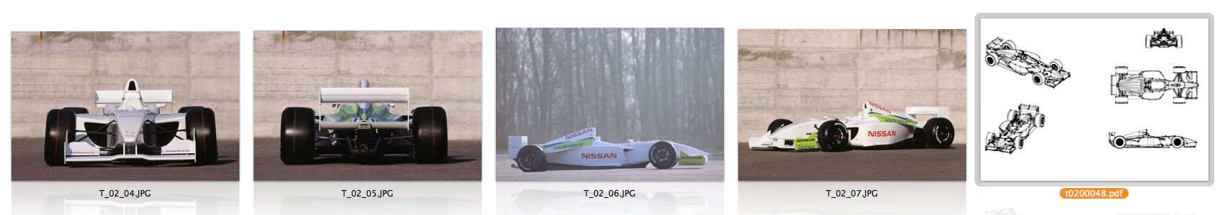
Dallara also sent over some of their launch images, although be careful as these have some differences to the production racer such as the rear winglet flick-ups ahead of rear wheels.
Unless on a tight deadline, I will redraw the car myself in Adobe Illustrator. I normally use 2-3 line weights with perimeter and shut lines thicker than any surface highlights (top of the side pod).
As this is for a Limited Edition Print, I added extra detail such as bodywork fixings.
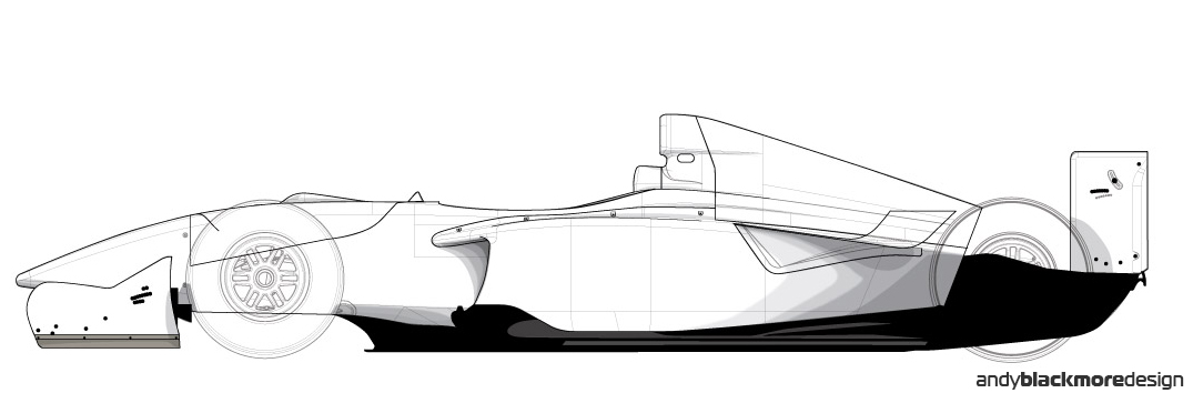
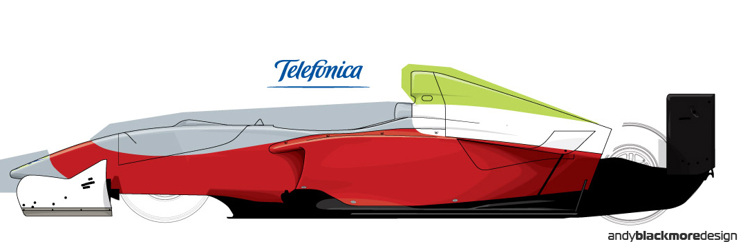
I also started to block in the shadows. Transparent hues for shadows and highlights can work differently across colors, so these cant be locked down until later.
If you are working in CMYK, then this proves more tricky, particularly if you are using 0:0:0:0. Shadows and highlights are always kept to their own layers so you can edit them. The original CAD screenshot is ghosted in here.
At this stage I normally block in color (a new layer at the bottom of the stack) so I can also add in the highlights. While the shadows are generally Black with a low transparency (5-30%) with layer mode on ‘Darken’, highlights are white with the layer mode on ‘Lighter’.
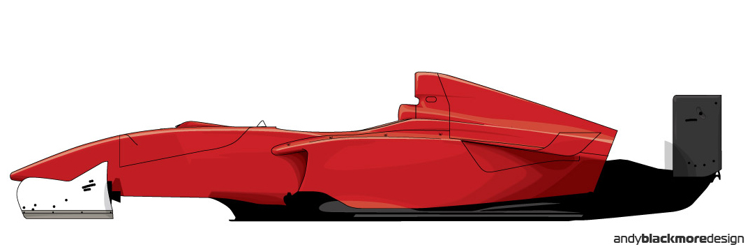
Highlights can be tricky as some colors, you need to really pump this. Red is a challenge as it can come across as pink, so if you look at the engine cover and sidepod, you will see I’ve layered highlights and shadows. I’ve also added some more subtle shadows to this. Again, this is very much an experience thing. Over time you learn what will work and what won’t.
I generally work with hard lines shadows as its quicker to iterate and results in a bolder graphic, but sometimes you want a soft edge.
One further world of warning, if someone else is going to use your file for print, check which version of Illustrator they have. Opening the file in an earlier version flattens the art and can mess up transparencies. I have a few tricks to avoid that, but still happens occasionally when someone goes in the file and believes that can modify it quickly!
This car has a simple color break, so I’ve added the blocks of color with bleed. I will then make a copy of the red and use the Pathfinder tool to intersect which gives you a clean edge. I had a previous project with Telefonica, so was able to take the colors and logo from that. Still had to draw the chequred flag graphic!
Don’t forger your cut outs such as roll-hoop, or if a closed roof car, potentially side windows.
Again, you will need to tweak the highlights accordingly.
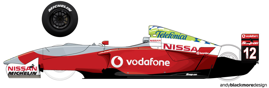
All the logos are placed now. If you are illustrating an existing car, choose an image or two as the definitive resource as these will move around a bit during the season. if you don’t have these logos to hand, then you can check vector site such as Brandsoftheworld.com but be aware these are often fan based and not official.
Another good resource are PDF’s. Look for a company brochure or Annual review and open these in Illustrator. Often you will find vector logos in there and the bonus….they are official.
If you can’t find vector, then search for high res JPEG and drop it into Illustrator and use Live Trace. As years and versions have gone by, it has got better. OK for a render, not good enough for sticker production.
As this car is over 12 years old, I had to find old Michelin and vodafone logos. The first I had from an old project. Vodafone proved harder so I had to use the current logo and ‘back-date’ it with the speech-marks inside the ‘o’
I will often arc logos to give the sense of a curved surface, If you look closely at Vodafone and Nissan on the engine cover, they are slightly arc’ed.
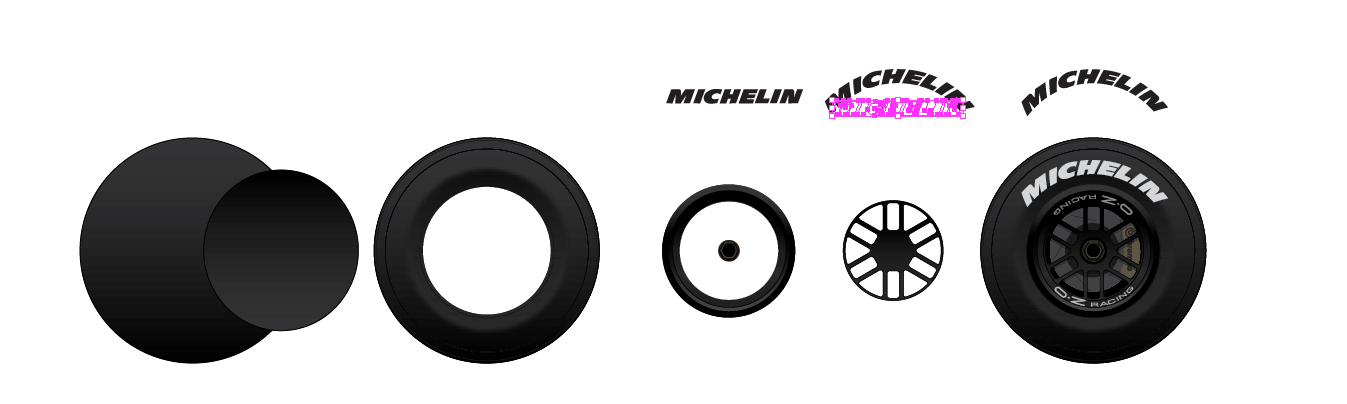
I also start the wheels and tyres at this point. Its something I can get really bogged down on and least enjoyable. I often leave these to the end!
Tyres (or Tires!) are relatively simple with smaller circles inset in the base circle for the tyre to show off the curvature of the sidewall. I have subtle gradient which is inverted to reflect light from above. To be honest, mine are simple affairs compared to other artists, but it works.
The best way to do tyre branding is to ensure the art is grouped or one object and apply an ‘Arc Effect’. You need to then ‘Expand Appearance’ to update the paths.
On a detailed illustration like this, I will also include the rotor (brake disc) and caliper. OZ branding is created the same was at Michelin.
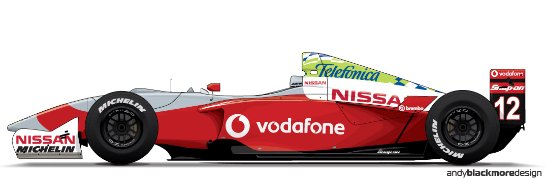
The final piece of art, I’ve adjusted highlights again, added the last details such as Peto tubes, mirrors etc.
I would have added more detail to floor, brakes, diffuser if this was bigger (it will be printed about 3-4 inches long)
Here is the art with the wire-frame ghosted in. As you can see its still relatively clean.
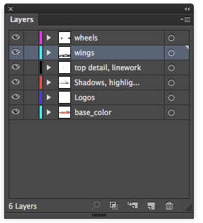
Layer structure is also kept clean. You can see logos and base color are at the bottom so you can change these easily.
This is essential for Spotter Guide art where you may end up with 10 or so different liveries on the same chassis.
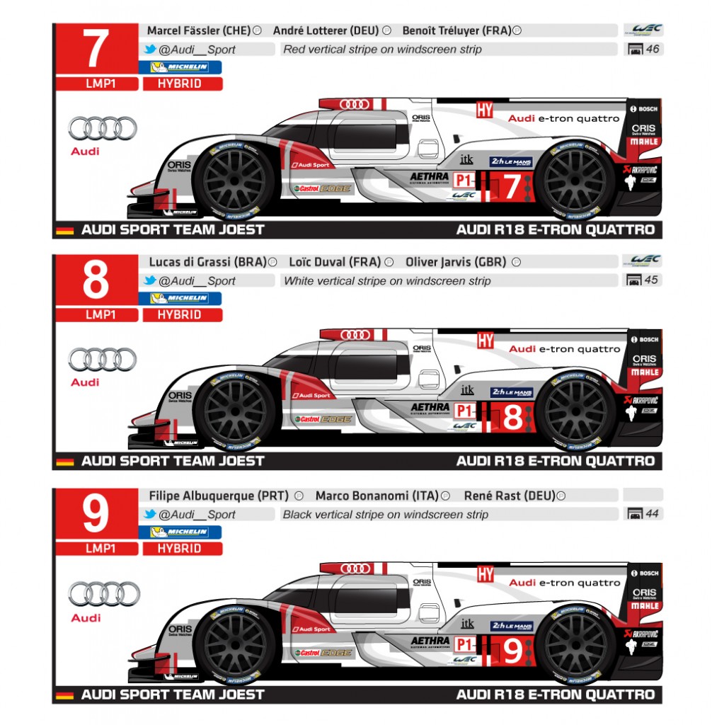
For those interested, I create the Spotter Guide art a similar way but with much less detail. Where possible I can obtain line art from teams or manufacturers which make completing 100+ cars (IMSA) n a month more achievable.
If you are creating a livery, once singed off, you need to add Bleed back into the art for the vinyl shop. You will also need to straighten out and arc’ed logos.
Hope you found this useful.
Useful Links: Portfolio: Detailed Illustrations