GARRA have been working with teams for new ideas to improve the look of GRAND-AM cars for the 2012 season via a chassis update. With his vehicle styling experience at McLaren, Yamaha, KWM, Arena and Electronic Arts, Andy was commissioned by Speed to work on some proposals. You can read the full article at SPEED.com.
Full Exclusive gallery with notes below, including a Corvette Racing version showing how far we could go without having a new chassis.
Marshall and I have been looking at the suggestions sent to teams and have developed some quick design studies, to explore the new look and potential OEM branding . GRAND-AM have suggested an update to its current range of chassis, rather than an all-new car.
Having said that, I have used Artistic license to explore a more extreme concept using Corvette as a base. You can view this image at the end of this article.
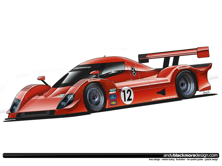
It is also important the car looks like a GRAND-AM, even if it has a smaller greenhouse. With this in mind, I have based the designs on the Riley Mk XX package. Overall proportions and dimensions are the same except the front nose, which is longer as suggested by GRAND-AM. When discussing the project with Marshall, we agreed a lower nose and smaller greenhouse were necessities.
Working from the front, the nose is longer than the current car with the central section lower to create a sleeker looking profile. Large headlamp surrounds will be able to accommodate all types of OEM light housings and look more aggressive than the small lights currently used in GRAND-AM.
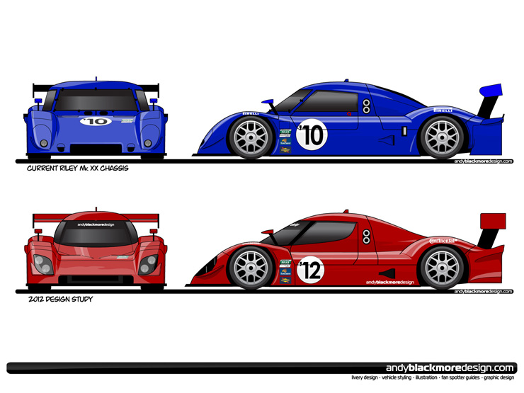
The lower radiator intake is wider than the current car, to include the brake ducts. Depending on OEM look these can be integrated or separate. The nose box bodywork is actually in two pieces, suggested by the shut-line above the headlamps. The front clip can be styled according to each GRAND-AM without having to produce an entire new nose cone for each chassis/engine combination. This should also reduces costs for replacement noses.
While the roof is at the same height, the cockpit has been reduced in size and given more tumblehome on the sides. Its still wider than an LMP to keep the GRAND-AM look, but its a lot more elegant and aerodynamic. The styling of the glasshouse is more dramatic with a smooth arc along the side, giving a helmet visor sort of look, moving away from the square look of the current car. The front screen has also been pulled further forward, which necessitates new surface treatment where it blends into the nose.
The narrower cockpit also allows the engine cover to be slim, again losing some visual bulk to the car.
The front fenders are similar to the current chassis, but the trailing edge tapers to a point as the sidepod height has been reduced. Along with the nose, this helps the car lose some visual bulk, helping the proportions of the car. The rear end has been tidied up. The old vertical ‘fence’ on the rear quarter has been replaced by a sculpted panel which is still full depth. Finally, the rear wing is now a two element device with larger endplates giving it some more presence than the current design.
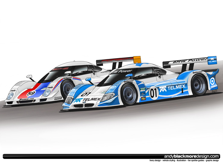
Having explored some OEM styling, I thought I would take this a stage forward and mock up a Ganassi and a Brumos Livery on the respective cars.
The basic concept was to add some OEM identity to the engine manufacturers. Rather than go the NASCAR route with sticker lights and grilles, we should be looking at actual surface changes, usable grilles and radiator intakes. When developing these ideas, I kept in mind the requirements of keeping these similar to its a fair playing field.
With this in mind, I imposed a surface rule which only allowed subtle surface changes to the form, although air intake shape was free, I would assume GRAND-AM might want to legislate on actual opening surface area.
If this were a live project, you would spend weeks, maybe months on creating an OEMlook, but I was limited to a couple of hours for each car.
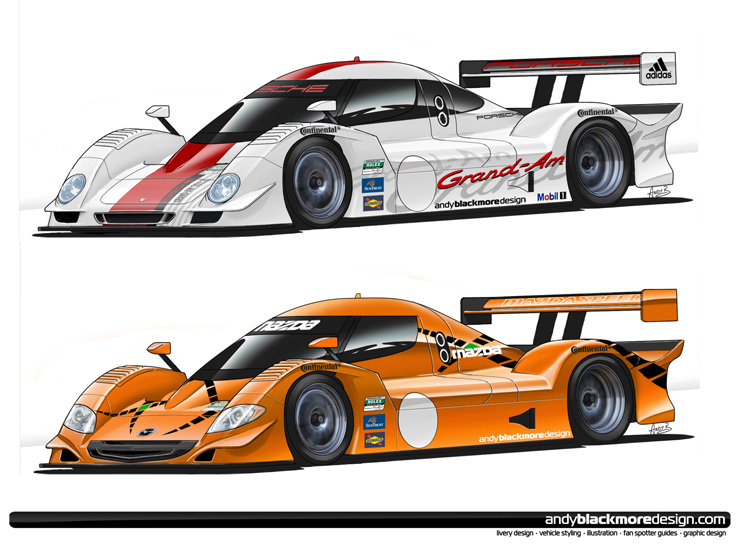
The Porsche was quite hard to develop. It would have been easy to use Cayenne style lights, but the Porsche DNA is really based around 911 style units which I’ve ended up using. I’ve mocked up a GT3 style central radiator intake with outer intakes for the brakes under the dive plane (canard). All needs development but its only a quick rendering.
Mazda was much easier to create thanks to its strong current design language. I have concentrated on their nose graphic seen on the Mazdaspeed3. The grille is a stretched version which has a black plastic section, just like the ‘3’. Two separate intakes, again like the roadcar help with that connection. Outer brake ducts are triangular, influenced by the surfacing of the Mazdaspeed 3 and MX-5.
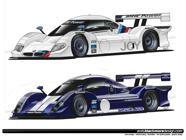
BMW have a very strong visual identity, but it doesn’t really lend itself so well to a race car. The headlamps are typical BMW with the indicators along the top, like the latest 5 series. Subtle surfacing either side of the BMW roundel leads to a stylized BMW kidney grille and stylized dive-planes which mimic the current styling on BMW front bumpers. The side window graphic has the trademark hockey stick shape, as used by Ganassi. To finish the design off.
The final OEM look is deliberately more conservative. Ford are in a transition period with their styling, so they don’t have one clear look. I’ve taken the Fiesta/Focus style lower radiator intake and squashed it into the front end. I have made no other surface changes to show the generic car could work without extensive OEM surface detailing.

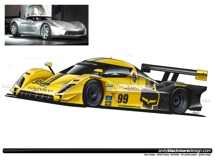
I wanted to push the envelope further, taking the design study one stage further and explored a more extreme design, based off of the 2009 Corvette Stingray Concept (inset), which is rumoured to preview the next generation Corvette C7.
With this proposal, I have changed the design of the nose, sidepod and fenders for a look, influenced by the concept. Glasshouse would remain as per the proposals above.
Although Chevrolet currently has a presence in GRAND-AM, this image, in no way suggests they would appear under the Corvette Racing banner.
– Andy Blackmore, 2010
Note: You are free to repost and use these images, providing these images are NOT modified in any way (other than cropping without losing the ABD footer graphic). Please provide a link back to AndyBlackmoreDesign.com
