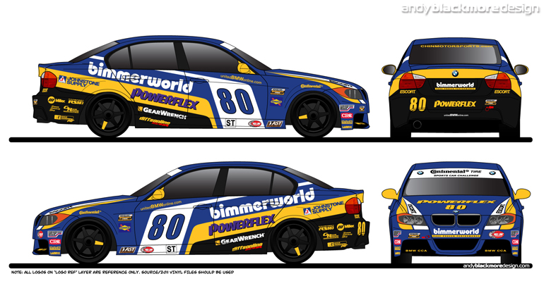
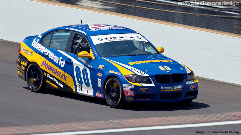
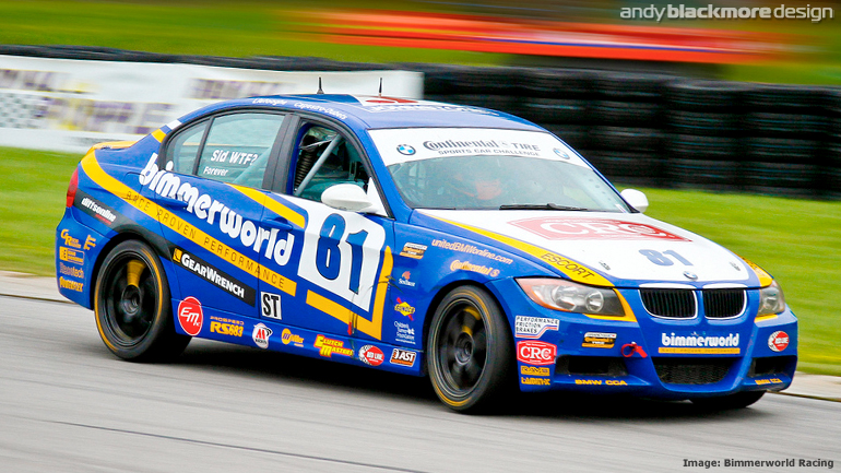
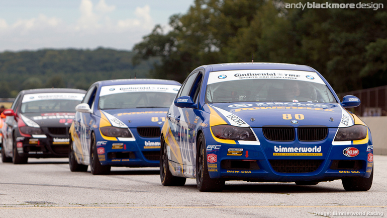
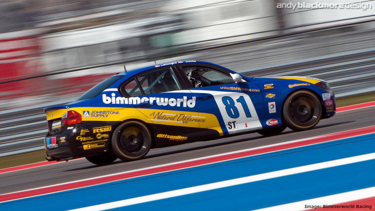
One of my favourite liveries is the Bimmerworld Racing Design which ran from 2012 (shown above) into 2013. I was originally contacted by Bimmerworld’s James Clay in early 2011 after a tip off from Marshall Pruett (Thanks Sir!).
Back in 2011, we had very little time to come up with a design, but I was pleased on how it came out.
Its great to work with teams who have an interest in design making it a two-way process. You are playing with their identity, so its important to understand what they, the client want.
Sometimes it can be a challenge with difference of opinion or too many cooks, but its always a pleasure working with James.
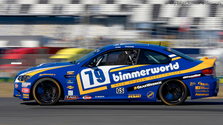
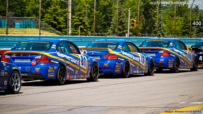
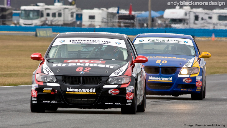
So, in summary, in 2011, Bimmerworld ran four cars in the Continental Tires Challenge series, support for GRAND-AM. Two ‘ST’ spec BMW 3 series sedans and two BMW M3 E92 coupes. Each car had slightly different branding and hood treatments.
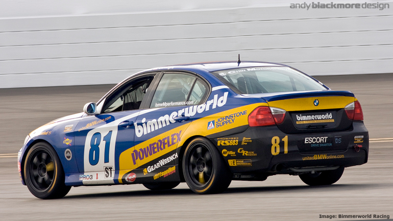
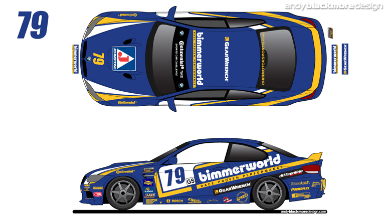 The side elevation was developed from the Bimmerworld logo along with my desire to incorporate the race number into the design.
GRAND-AM/NASCAR events are easier as they allow the teams to specific colouration and font, but it looks so much better than a square sticker slapped on the door. On the flip side, the number needs to stand out, so there is a balance. I was pleased with the design, particularly given the timescale.
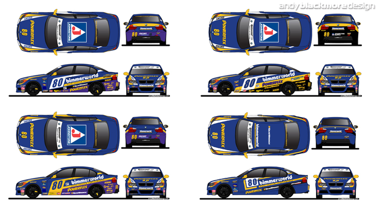
Having (hopefully!) proved myself to James in 2011, we discussed the 2012 design much earlier and I was able to produce a wide range of designs. We both wanted to incorporate the Bimmerworld logo into the design more, but allow other brands such as Powerflex to stand out as well. In the final version, we dropped the BW strap line and made the Yellow band much thicker.
A selection of concepts are shown above.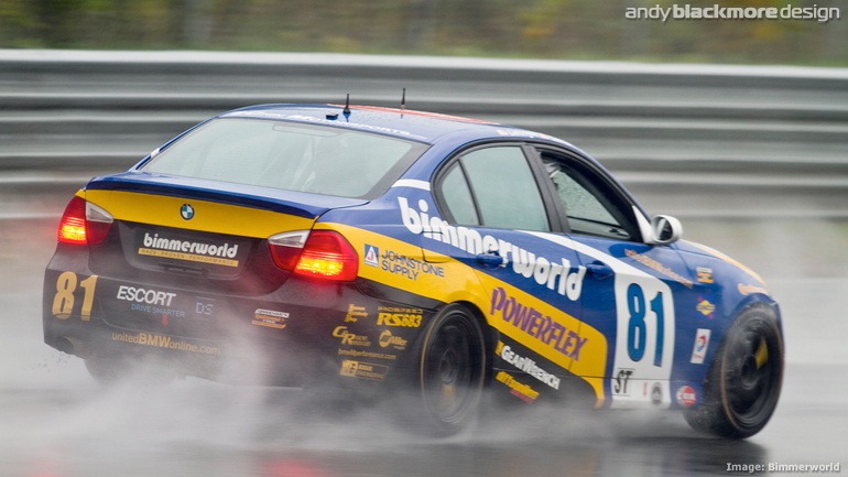
As is often the case, the final design was developed from bits and pieces from various concepts along with their existing identity.
The angled graphics while a necessity due to the long Bimmerworld graphics gives the cars a sense of speed at standstill, but work even better at speed. These cars are quick, so it was important for all the clients to have a clear, clean livery.
I also consulted on the design for their extra Brakleen entry which used elements of the Blue cars to give a ‘works’ look.
It was a great year for the team, taking wins and also the Manufacturer Title for BMW.
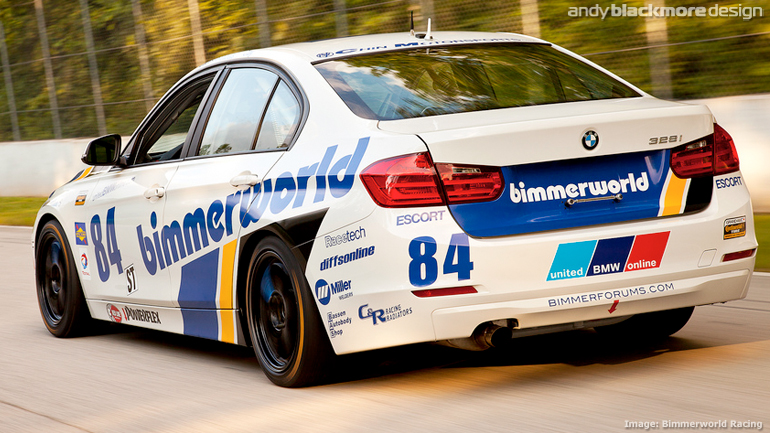
For the 2013 season, Bimmerworld continued with the design, with some sponsor updates, while I was commissioned to work on an all-new look as their brand develops. 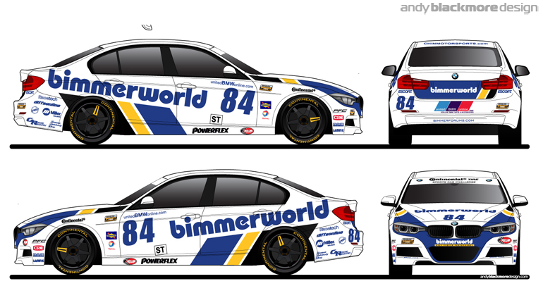
Their new website has more white and less blue, tie this into a BMW Motorsport look and feel and the only direction was to go with a White base on their all new F90 chassis which was introduced later into the season.
Over the past years, Bimmerworld have also recommended me to a number of their clients.

